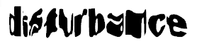
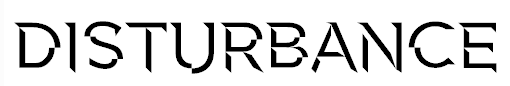
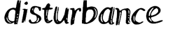
We have called our title Disturbance. We have used this word because it has connotations of being unsettled or broken up. This links to our film because the victims are disturbed by the killer. Also the killer has 'broken up' many of the victim's life and we want this to be portrayed within the title. The title is short which draws attention and will captivate the audiences attention. Here are some examples of what our titles font may look like:
|
This is a font that we wouldn't use because it is unclear what the title is and the writing is way to thick and bold for us to read.
|
|
This isn't a good title for a horror film because it looks as though it would be used in a romance because of the bubbled writing.
|
We could use this as our title as it is very clear and the font looks very unusual and would be something you may see in a horror film.
|
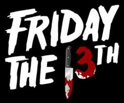
Friday the 13th is known as a day of bad luck. With the film being called this it indicates to the audience that the film isn't going to be one of the nicest and bad things will happen. As there is a picture of a knife and blood one the 3 suggests that somebody is going to get stabbed and the film isn't going to end well.
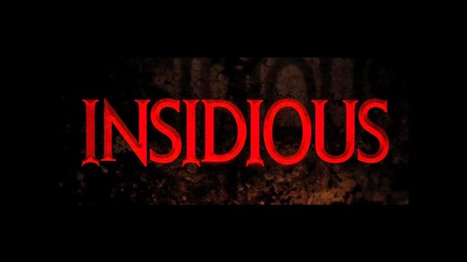
Insidious means 'proceeding in a gradual, subtle way, but with very harmful effects' which implies that that characters who we see in this movie test their luck to the point where something bad or disastrous happens. The font is very large, bold and in your face which suggests that because the title and font is large and big, that the monster/demon in the film is very dangerous. The colour of the text is red which is usually associated with danger, death and blood, which could easily suggest or hint at what the film is about.
